
Better Ways to Visualize Online Girl Scout Cookie Sales
- Alyson La
- Feb 3
- 1 min read

Updated: Feb 15
One of the first things we discuss in our Tech-Moms data analytics class is that...not all pie charts are evil! (Shout-out to Storytelling with Data for a great primer on what makes a pie chart work.)
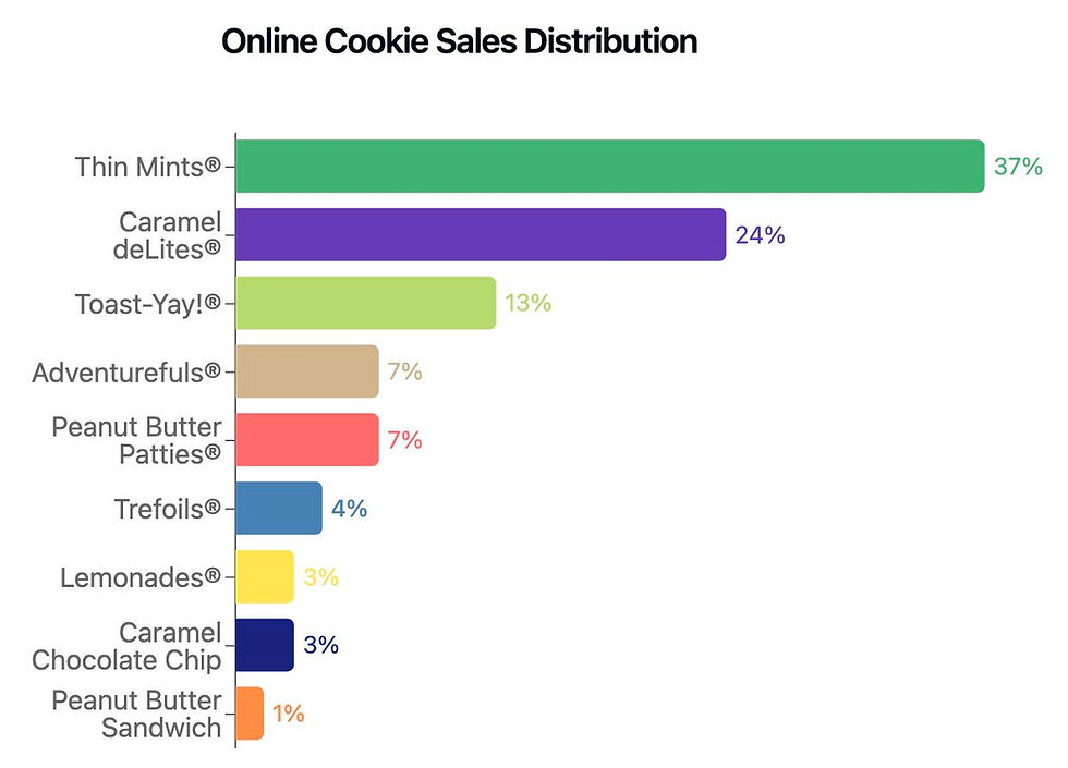
However, this "Online Sales by Cookie" pie chart (from my daughter's Girl Scout cookie website) could use some TLC.

So, what can we do to improve it?
👉 Use a bar chart instead of a pie chart. With so many slices, it’s hard to compare sizes visually. A horizontal bar chart sorted by percentage makes each cookie’s share easier to compare at a glance.

👉 Label the bars directly, use color-coordinating percentages & remove the x-axis. This keeps people from bouncing between the axis and the bars in order to identify the percentage.
👉 Remove decimals to reduce visual clutter
But what if we really, really want to use a pie chart?
👉 Combine smaller slices into an “Other” category to reduce clutter.
👉 Sort slices from largest to smallest so viewers see the larger proportions first.

👉 Try a donut chart - the pie chart’s younger, cooler cousin.


At the end of the day, beauty is in the eye of the beholder. The best way to know if your chart works is to show it to people and see what they think.
Which data visualization is easiest for YOU to read?

Comments